
Event Website Design to Maximise Registration
Having stepped into a new decade, how can we do things differently this 2020 that could help maximize registrations?
Bright Bold Colors
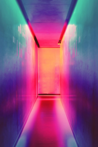
Daring shades of teal, electric purple, and even yellow are all visually impactful statement colours, which are worth considering for your event website designs.
As more and more technology adopts IPS displays (the new and improved LED screens that make it easy to view a wider range of hues), we can expect to see this become a trend in the coming year.
Consider using bright colours if your target audience is men or soft tones if your target audience is women, to maximising event registrations.
But if you’re trying to appeal to a wider crowd than just genders, use blues, reds, oranges, purples, greens, and greys, all of which are considered to be among the best colours for websites.
3D Artwork
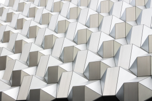
Whether it’s to provide entertainment, help users view products better, or to simply give an overall better site experience, 3D artwork is a trend worth taking a second look at. Just make sure the 3D artwork the event organiser in Singapore choose to include specifically helps to showcase your brand influence, improve the customer journey, and/or keep the visitor on your site for longer than normal (a key factor in conversion rates).
Video Content

Having a video is still the most popular and engaging marketing content type out there today. Not only is it great for Search Engine Optimization, video content can also be used to provide value to event website visitors in many different ways. From providing registration details to showcasing last year’s event’s highlights, it can even share exclusive tips from event speakers! A video content is definitely a versatile too to have for your event website design. To get the most out of your video content, make sure you use the following tips in your web design:
- Focus on one topic per video.
- Provide exclusive content they won’t see anywhere else online.
- Include a video on your homepage (don’t let it autoplay).
- Place related Click-To-Action buttons directly under the video player where it’s visible
Simplicity and Minimalism

Simpler interfaces, crisper site layouts, fewer navigation or button options, and an overall more streamlined customer journey; think of these when working with your event company in Singapore on the event website brainstorming session. Imagine a sales funnel that is shorter, straighter and more direct; this will affect what you choose to include (or leave out) from your event website design.
Once you have a clear action funnel in place, you’re already more than halfway to seeing higher conversion rates. To drive this goal home, have a firm understanding of your single greatest event value proposition, this unique selling point will determine what does and does not get featured in the final site design.
Entertaining Microinteractions

Microinteractions are those surprise moments when things come to life on the webpage that gives an unexpected experience for users. Although they’re incredibly short, microinteractions are great for getting your audience excited about your event and fleshing out your brand even further.
Here are some delightful microinteractions you can try in your event website design:
- Transform one image into another as users scroll
- Add mini games that entertain, educate, or reward visitors
- Make floating objects appear over images
- Have interactive graphics wipe away or create descriptions
Sometimes, all it takes is a few reminders, sudden stroke of inspiration plus a dash of creativity to create an impressive online registration experience for the users. Excited to start brainstorming on your next event webpage design? Contact Twist Media to get the ball rolling!